S
SORT
sort-office.com · set in Segoe UI
SaveUnofficial A style guide made by SiteStyleGuide from theverge.com’s public web pages. Not affiliated with or endorsed by The Verge. The real site is theverge.com ↗

Unofficial style guide
The Verge’s website (theverge.com) uses Segoe UI for its headings and body text. Its palette is led by Aqua Marine (#3CFFD0), Blue (#5200FF) and Crimson (#EE0033), with #000000 text on #FFFFFF. Captured from the live site on 25 October 2026.
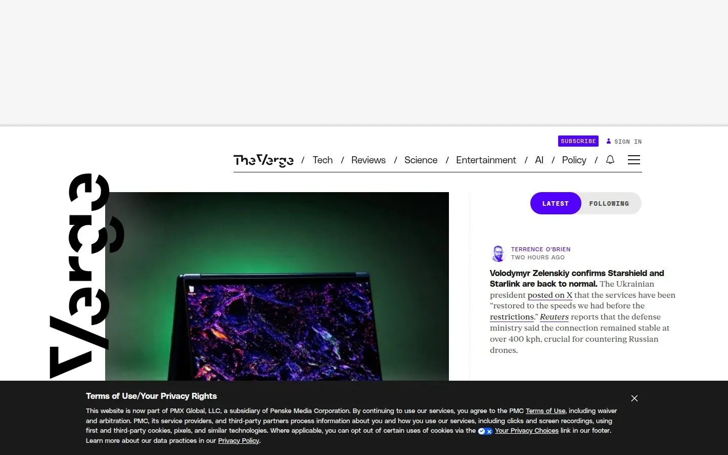

Identity & metadata
What browsers, search engines and social cards show before anyone reaches the page, from the homepage’s <head>.
In search results
 The Vergehttps://www.theverge.com/
The Verge
The Verge is about technology and how it makes us feel. Founded in 2011, we offer our audience everything from breaking news to reviews to award-winning features…
When shared

theverge.com
The Verge
The Verge is about technology and how it makes us feel. Founded in 2011, we offer our audience everything fro…
Logo & favicons
Found as: schema.org logo. PNG, 500 × 120.
On white
On black
On Aqua Marine
 752 px · SVG
mask-icon
 512 px · PNG
icon
 192 px · PNG
icon
 180 px · PNG
apple-touch-icon
 96 px · PNG
icon
 48 px · ICO
shortcut icon
32 px · PNG
icon
 16 px · PNG
icon
The Verge
Light browser tab
The Verge
Dark browser tab
Colour
Read from the site’s stylesheets and weighted by where each colour is used. Names are the nearest standard colour name. Click a swatch to copy its hex code.
Contrast is against the site’s text colour (#000000) and white, using WCAG 2 ratios: 4.5 for body text, 3 for large text.
By how often each colour appears in the site’s CSS, weighted by where (body, headings, buttons), not by area on the screen.
Text, background, border · ._1ajq89k17, ._1c6ljn72
Text, background, graphic · ._1c6ljn73, ._1c6ljn74
Text, background · .kaknih7, ._16apfq35
Background, border · .kaknih5, ._1k8kvzd1
Background, graphic, text · ._971sic0, ._971sic3
Background, text · ._1c8yj4y0, ._16apfq33
Text, border · .rq560b2, .rq560b3
linear-gradient(#ffffff4d 0%,#fff0 100%)
linear-gradient(#0000004d 0%,#0000 100%)
linear-gradient(90deg,#fff0,#fff)
Typography
Faces from Google Fonts are shown in the real thing. Others are licensed to the site, so they show in your device’s copy if you have one, or a stand-in if not.
Segoe UI
System font, or not loaded on this page · body · shown in a stand-in if you don’t have it
polySansMono
Self-hosted · weights 400, 500, 700 · shown in a stand-in if you don’t have it
fkRomanStandard
Self-hosted · weights 400, 700 · shown in a stand-in if you don’t have it
manuka
Self-hosted · weights 900 · shown in a stand-in if you don’t have it
ABCDEFGHIJKLMNOPQRSTUVWXYZ
abcdefghijklmnopqrstuvwxyz
0123456789 ! ? & @ % $ – ’ “ ”
The Verge is about technology and how it makes us feel. Founded in 2011, we offer our audience everything from breaking news to reviews to …
Get started
Elements
The main button and link as the site’s CSS draws them, and the corner radii and shadows it uses most.
Corner radius
Shadows
Layout
Breakpoints from the site’s media queries and the widths its content is held to, with how often each appears.
Breakpoints
On a scale of 0 to 1440 px.
Content widths (max-width)
Notes
Plain checks on what was found. Worth fixing if you look after this site.
Questions
Quick answers, from the same capture as the rest of this guide.
Design tokens
Everything above as CSS variables, ready to paste into a project. Members can download the tokens as files for Figma (Tokens Studio), Style Dictionary and Tailwind.
/* theverge.com design tokens, from SiteStyleGuide (https://sitestyleguide.com/theverge.com) */
:root {
  /* Colours */
  --text: #000000;
  --background: #FFFFFF;
  --colour-white: #FFFFFF;
  --colour-black: #000000;
  --colour-near-black: #131313;
  --colour-off-white: #E8E8E8;
  --colour-aqua-marine: #3CFFD0;
  --colour-blue: #5200FF;
  --colour-crimson: #EE0033;
  --gradient-1: linear-gradient(#ffffff4d 0%,#fff0 100%);
  --gradient-2: linear-gradient(#0000004d 0%,#0000 100%);
  --gradient-3: linear-gradient(90deg,#fff0,#fff);

  /* Typefaces */
  --font-body: ui-sans-serif, system-ui, -apple-system, blinkmacsystemfont, 'Segoe UI', 'Roboto';
  --font-other: 'polySansMono', 'polySansMono Fallback', 'Courier New', 'Courier', monospace;

  /* Type scale */
  --text-small: 80%;
  --text-button: 100%;

  /* Shape */
  --radius-1: 50%;
  --radius-2: 20px;
  --radius-3: 24px;
  --radius-4: 10px;
  --radius-5: 12px;

  /* Layout (breakpoints can’t be used in media queries as variables; they’re here for reference) */
  --breakpoint-1: 767px;
  --breakpoint-2: 768px;
  --breakpoint-3: 900px;
  --breakpoint-4: 901px;
  --breakpoint-5: 1179px;
  --breakpoint-6: 1180px;
  --breakpoint-7: 1181px;
  --breakpoint-8: 1300px;
  --max-width-1: 1100px;
  --max-width-2: 800px;
  --max-width-3: 700px;
  --max-width-4: 600px;
  --max-width-5: 450px;
  --max-width-6: 320px;
}
{
    "site": "theverge.com",
    "source": "https://sitestyleguide.com/theverge.com",
    "text": "#000000",
    "background": "#FFFFFF",
    "colours": [
        {
            "name": "White",
            "hex": "#FFFFFF",
            "rgb": [
                255,
                255,
                255
            ]
        },
        {
            "name": "Black",
            "hex": "#000000",
            "rgb": [
                0,
                0,
                0
            ]
        },
        {
            "name": "Near Black",
            "hex": "#131313",
            "rgb": [
                19,
                19,
                19
            ]
        },
        {
            "name": "Off White",
            "hex": "#E8E8E8",
            "rgb": [
                232,
                232,
                232
            ]
        },
        {
            "name": "Aqua Marine",
            "hex": "#3CFFD0",
            "rgb": [
                60,
                255,
                208
            ]
        },
        {
            "name": "Blue",
            "hex": "#5200FF",
            "rgb": [
                82,
                0,
                255
            ]
        },
        {
            "name": "Crimson",
            "hex": "#EE0033",
            "rgb": [
                238,
                0,
                51
            ]
        }
    ],
    "fonts": [
        {
            "name": "Segoe UI",
            "stack": "ui-sans-serif, system-ui, -apple-system, BlinkMacSystemFont, Segoe UI, Roboto, Helvetica Neue, Arial, Noto Sans, sans-serif, Apple Color Emoji, Segoe UI Emoji, Segoe UI Symbol, Noto Color Emoji",
            "weights": [],
            "source": "System font, or not loaded on this page"
        },
        {
            "name": "polySansMono",
            "stack": "'polySansMono', 'polySansMono Fallback', Courier New, Courier, monospace, ",
            "weights": [
                400,
                500,
                700
            ],
            "source": "Self-hosted"
        },
        {
            "name": "fkRomanStandard",
            "stack": "fkRomanStandard, fkRomanStandard Fallback, Georgia, serif",
            "weights": [
                400,
                700
            ],
            "source": "Self-hosted"
        },
        {
            "name": "manuka",
            "stack": "manuka, manuka Fallback, Impact, Helvetica, sans-serif",
            "weights": [
                900
            ],
            "source": "Self-hosted"
        },
        {
            "name": "polySans",
            "stack": "polySans, polySans Fallback, Helvetica, Arial, sans-serif",
            "weights": [
                300,
                400,
                500,
                700
            ],
            "source": "Self-hosted"
        },
        {
            "name": "Helvetica Neue",
            "stack": "Helvetica Neue",
            "weights": [
                300
            ],
            "source": "System font, or not loaded on this page"
        }
    ]
}
Share
Links open each service’s own share page. Nothing from them loads here.
Link to this guide from your own site, so your team, designers and agencies can find your colours and fonts in one place.

<a href="https://sitestyleguide.com/theverge.com" title="The Verge style guide on SiteStyleGuide"><img src="https://sitestyleguide.com/public/badge.svg" alt="View our style guide on SiteStyleGuide" width="200" height="44"></a>

digitalspy.com · 5 days ago
Save
steemit.com · 4 days ago
Save
emotedigital.com.au · 20 hours ago
Save
pirillo.com · 5 days ago
SaveCaptured from theverge.com on 25 October 2026. SiteStyleGuide isn’t affiliated with or endorsed by The Verge; this guide describes the public website for reference.
Analytics cookies
We’d like to use Google Analytics cookies to count visits and see which pages are useful. Nothing is used for advertising.


