
Tavla
tavlahq.com · set in Clash Display
SaveUnofficial A style guide made by SiteStyleGuide from cannesprlions.com’s public web pages. Not affiliated with or endorsed by ブックメーカー. The real site is cannesprlions.com ↗

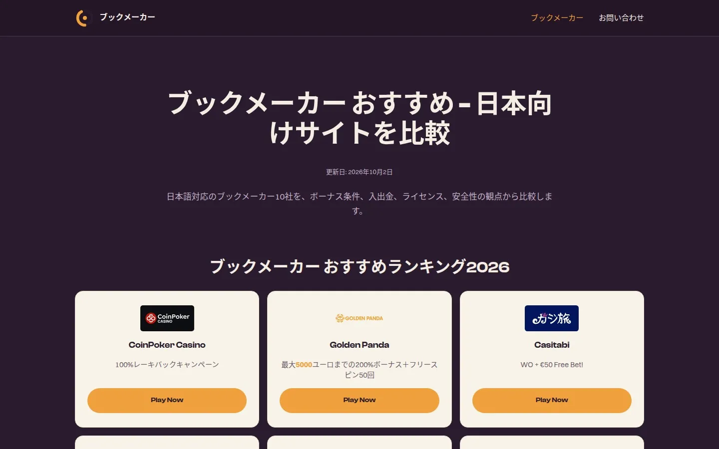
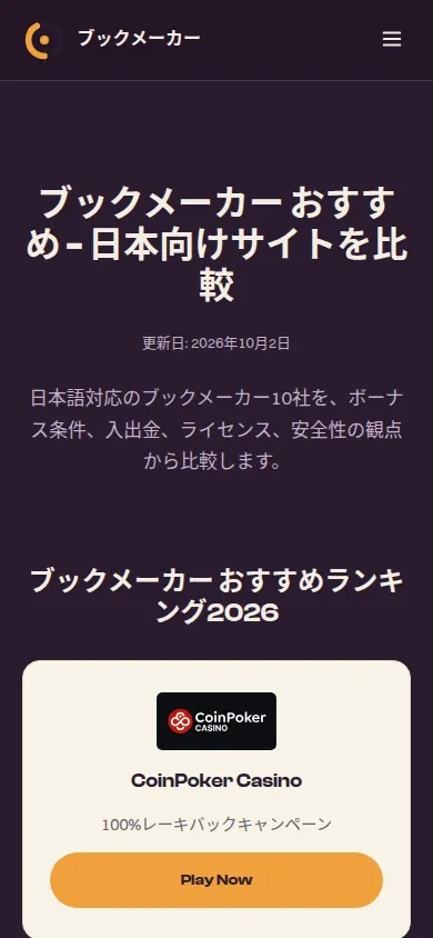
Unofficial style guide
ブックメーカー’s website (cannesprlions.com) sets its headings in Clash Display and its body text in Switzer. Its palette is led by Black (#2A1B2E), Orange (#F0A03C) and Thistle (#C2B1C8), with #C2B1C8 text on #2A1B2E. Captured from the live site on 26 October 2026.
Identity & metadata
What browsers, search engines and social cards show before anyone reaches the page, from the homepage’s <head>.
In search results
 ブックメーカーhttps://cannesprlions.com/
ブックメーカー おすすめ - 日本向けサイトを比較
日本語で使えるブックメーカー10社をランキング順に比較。サッカーや野球の市場、ボーナスの賭け条件、入出金、KYC、オフショアライセンスと日本法の違いを解説します。
When shared
cannesprlions.com
ブックメーカー おすすめ - 日本向けサイトを比較
日本語で使えるブックメーカー10社をランキング順に比較。サッカーや野球の市場、ボーナスの賭け条件、入出金、KYC、…
Logo & favicons
Found as: image in the header. SVG, 100 × 100.
On white
On black
On Black
100 px · SVG
icon
ブックメーカー おすすめ - 日本向けサイトを比較
Light browser tab
ブックメーカー おすすめ - 日本向けサイトを比較
Dark browser tab
Colour
Read from the site’s stylesheets and weighted by where each colour is used. Names are the nearest standard colour name. Click a swatch to copy its hex code.
Contrast is against the site’s text colour (#C2B1C8) and white, using WCAG 2 ratios: 4.5 for body text, 3 for large text.
By how often each colour appears in the site’s CSS, weighted by where (body, headings, buttons), not by area on the screen.
Text, background · h1, .prose h2
Background, text · body, .site-header
Text, background, border · .header-nav a.is-active, .footer-marks
Text · body, .hero-date
Border · .site-header, --brand-line
Background · .prose table, .faq-item
Text · .obonus, .oterms
Background, text · --brand-accent-hover, --brand-cta-hover
Typography
Faces from Google Fonts are shown in the real thing. Others are licensed to the site, so they show in your device’s copy if you have one, or a stand-in if not.
Clash Display
Served from cdn.fontshare.com · weights 500, 600, 700 · headings · shown in a stand-in if you don’t have it
Switzer
Served from cdn.fontshare.com · weights 400, 500, 600, 700 · body · shown in a stand-in if you don’t have it
ABCDEFGHIJKLMNOPQRSTUVWXYZ
abcdefghijklmnopqrstuvwxyz
0123456789 ! ? & @ % $ – ’ “ ”
ブックメーカー
ブックメーカー おすすめ - 日本向けサイトを比較
ブックメーカー おすすめ - 日本向けサイトを比較
ブックメーカー おすすめ - 日本向けサイトを比較
日本語で使えるブックメーカー10社をランキング順に比較。サッカーや野球の市場、ボーナスの賭け条件、入出金、KYC、オフショアライセンスと日本法の…
Read more about ブックメーカー
Elements
The main button and link as the site’s CSS draws them, and the corner radii and shadows it uses most.
Corner radius
Layout
Breakpoints from the site’s media queries and the widths its content is held to, with how often each appears.
Breakpoints
On a scale of 0 to 1440 px.
Content widths (max-width)
Notes
Plain checks on what was found. Worth fixing if you look after this site.
Questions
Quick answers, from the same capture as the rest of this guide.
Design tokens
Everything above as CSS variables, ready to paste into a project. Members can download the tokens as files for Figma (Tokens Studio), Style Dictionary and Tailwind.
/* cannesprlions.com design tokens, from SiteStyleGuide (https://sitestyleguide.com/cannesprlions.com) */
:root {
  /* Colours */
  --text: #C2B1C8;
  --background: #2A1B2E;
  --colour-warm-off-white: #F4EDE4;
  --colour-black: #2A1B2E;
  --colour-orange: #F0A03C;
  --colour-thistle: #C2B1C8;
  --colour-dark-slate-blue: #4A3650;
  --colour-midnight-blue: #372440;
  --colour-dim-grey: #6E5A6B;
  --colour-peru: #D98A26;

  /* Typefaces */
  --font-headings: 'Clash Display', 'Avenir Next', 'Segoe UI', system-ui, sans-serif;
  --font-body: 'Switzer', -apple-system, blinkmacsystemfont, 'Segoe UI', 'Roboto', 'Helvetica';

  /* Type scale */
  --text-h2: 1.6rem;
  --leading-h2: 1.15;
  --text-h3: 1.2rem;
  --leading-h3: 1.15;
  --text-body: 16px;
  --leading-body: 1.7;
  --text-a: .95rem;

  /* Shape */
  --radius-1: 11px;
  --radius-2: 999px;
  --radius-3: 12px;
  --radius-4: 16px;

  /* Layout (breakpoints can’t be used in media queries as variables; they’re here for reference) */
  --breakpoint-1: 560px;
  --breakpoint-2: 768px;
  --breakpoint-3: 860px;
  --breakpoint-4: 900px;
  --max-width-1: 1180px;
  --max-width-2: 900px;
  --max-width-3: 780px;
}
{
    "site": "cannesprlions.com",
    "source": "https://sitestyleguide.com/cannesprlions.com",
    "text": "#C2B1C8",
    "background": "#2A1B2E",
    "colours": [
        {
            "name": "Warm Off White",
            "hex": "#F4EDE4",
            "rgb": [
                244,
                237,
                228
            ]
        },
        {
            "name": "Black",
            "hex": "#2A1B2E",
            "rgb": [
                42,
                27,
                46
            ]
        },
        {
            "name": "Orange",
            "hex": "#F0A03C",
            "rgb": [
                240,
                160,
                60
            ]
        },
        {
            "name": "Thistle",
            "hex": "#C2B1C8",
            "rgb": [
                194,
                177,
                200
            ]
        },
        {
            "name": "Dark Slate Blue",
            "hex": "#4A3650",
            "rgb": [
                74,
                54,
                80
            ]
        },
        {
            "name": "Midnight Blue",
            "hex": "#372440",
            "rgb": [
                55,
                36,
                64
            ]
        },
        {
            "name": "Dim Grey",
            "hex": "#6E5A6B",
            "rgb": [
                110,
                90,
                107
            ]
        },
        {
            "name": "Peru",
            "hex": "#D98A26",
            "rgb": [
                217,
                138,
                38
            ]
        }
    ],
    "fonts": [
        {
            "name": "Clash Display",
            "stack": "'Clash Display', 'Avenir Next', 'Segoe UI', system-ui, sans-serif",
            "weights": [
                500,
                600,
                700
            ],
            "source": "Served from cdn.fontshare.com"
        },
        {
            "name": "Switzer",
            "stack": "'Switzer', -apple-system, BlinkMacSystemFont, 'Segoe UI', Roboto, Helvetica, Arial, sans-serif",
            "weights": [
                400,
                500,
                600,
                700
            ],
            "source": "Served from cdn.fontshare.com"
        }
    ]
}
Share
Links open each service’s own share page. Nothing from them loads here.
Link to this guide from your own site, so your team, designers and agencies can find your colours and fonts in one place.

<a href="https://sitestyleguide.com/cannesprlions.com" title="ブックメーカー style guide on SiteStyleGuide"><img src="https://sitestyleguide.com/public/badge.svg" alt="View our style guide on SiteStyleGuide" width="200" height="44"></a>
Captured from cannesprlions.com on 26 October 2026. SiteStyleGuide isn’t affiliated with or endorsed by ブックメーカー; this guide describes the public website for reference.
Analytics cookies
We’d like to use Google Analytics cookies to count visits and see which pages are useful. Nothing is used for advertising.


